Background
As racial tensions and hate crimes are on the rise and brought to light, we wanted to help motivate people to take individual action to contribute to a larger cause of fostering inclusive communities. In the span of six weeks, our team designed a human-centered platform that encourages users to learn, discuss, and donate to causes related to hate crime.
We presented our project to a panel of industry professionals on Presentation Day, an event hosted by Design Interactive, the first UX organization at UC Davis. We were awarded Most Customer-Centric Experience, Most Innovative UX, and runner up for the Audience Choice Award.
Role
UX Design, User Research Lead
Duration
6 weeks
Team
Rachel Yap, Kai Maurer-Mabanglo, Jessica Hua
Tools
Figma, Notion, Google Forms
Problem
Young adults in America have trouble staying informed on hate crimes due to scattered resources and lack of conversations about issues of inequality, justice, and discrimination.
More people are using online platforms to learn about hate crimes, but the process remains confusing for many. Our team wanted to tackle these barriers and figure out, how might we encourage people to take action against hate crimes?
Initial Direction
Our project began with exploratory research focusing on the fundraising process behind anti-hate crime campaigns. We created a survey that received 51 responses and conducted 6 user interviews, aiming to learn more about financial support against hate crime. However, through surveys and interviews, we realized a different problem at hand. Users shared a desire to educate and inform themselves on current issues about hate crimes.
"Informing yourself is important. Donating can feel surface level at times, whereas reading and understanding what's happening feels more powerful."
Changing Directions
After our first round of research we realized the topic we were designing around did not align with our users' needs. Solely focusing on monetary support to fight hate crime is insufficient for long term change that our users hoped to achieve, leading us to take a new direction.
After we developed a new problem statement that allowed us to explore more solutions, we set off on a second round of user research complete with additional interviews and surveys that focused on answering, “How might we encourage people to take action against hate crime?”
USER RESEARCH
Kickstarting research with literature
Our team began research with a quick literature review. Articles from the Department of Justice and NBC emphasized the urgency of rising hate crime against certain communities. This helped catapult our research to learn more about the problem at hand and possible ways to combat it.
USER RESEARCH
Empathizing with our users
To learn more about our users, we developed general research questions to outline our research goals about different aspects of hate crime.
01 Education
How and where are users getting educated on hate crimes?
02 Action
How do users actively fight against hate crimes?
03 Spreading Awareness
How and with who are users sharing information about hate crimes with?
Surveys
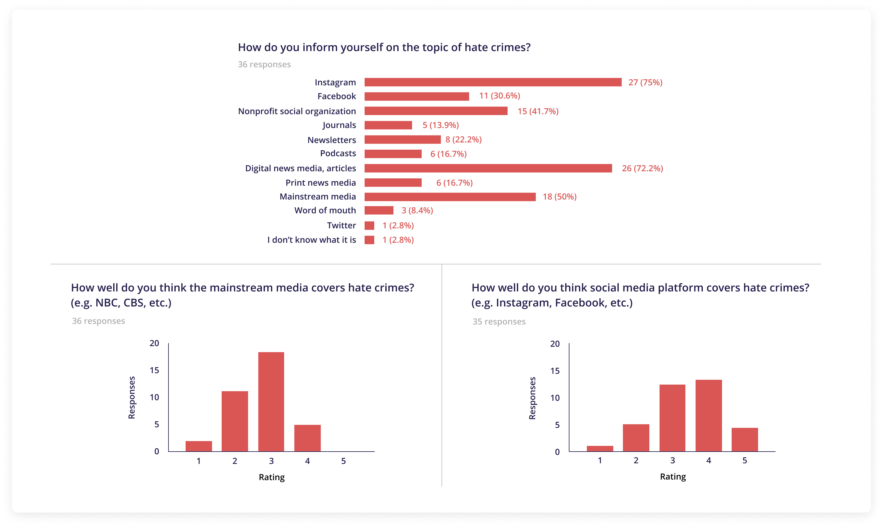
Our survey asked both open and closed-ended questions to identify how people engage, why they engage, and where they engage with the topic of hate crimes. Of the 36 responses we received from young adults (ages 18-22), 75% use Instagram and 72% use digital news media to stay informed on hate crimes. Additionally, many mentioned that the best way to combat hate crime is to stay informed and spread awareness about the topic.
Interviews
We conducted a total of 6 user interviews to gain a deeper understanding of our users by having them elaborate on their survey answers and asking additional questions.
01 Education
(E.g. How do you inform yourself on the topic of hate crimes? How well do you think social media platforms cover hate crimes?)
02 Action
(E.g. What do you think is the best way to do your part in fighting against hate crimes? How do you show your support as an ally?)
03 Spreading Awareness
(E.g. How often do you share information about hate crimes or other current issues? Have you had conversations with friends about hate crimes?)
USER RESEARCH
Pain Points
After gathering survey responses and conducting user interviews, we were surprised to learn how scattered pathways to taking action against hate crimes were. Users used a variety of platforms and sources, but similar pain points arose among them.
01. Absence of dialogue between users
Heavy topics like hate crime are often hard to talk about because it can be a sensitive topic for many, resulting in a lack of important conversation.
"I don't often have conversations with friends because it's hard to bring up something that's hard to talk about. I think there should be more conversations about it though."
02. Concerns about legitimacy of sources
Mainstream media can often show bias and distort news, while social media posts may not give users the full story, only a surface level understanding.
"I think mainstream media distorts news to gain attention and can appeal to audiences with misleading headlines since they're running a business."
03. Frequency of performative activism
Users may feel pressure to show activism on social media to avoid judgement from others, resulting in a simple repost without understanding.
"Sharing information on social media starts to feel performative because everyone reposting the same things can lead to many people just glancing and skipping over. Personal, everyday conversations about these topics are better."
04. Lack of cohesion between different platforms
Different sources can tell different versions of a story that may not always align, sometimes causing confusion among users.
"I feel like platforms can be exploited and this ranges from Facebook, to Instagram, to GoFundMe. Sometimes the post may not contain the whole story."
USER RESEARCH
Competitive Analysis
USER RESEARCH
User Personas
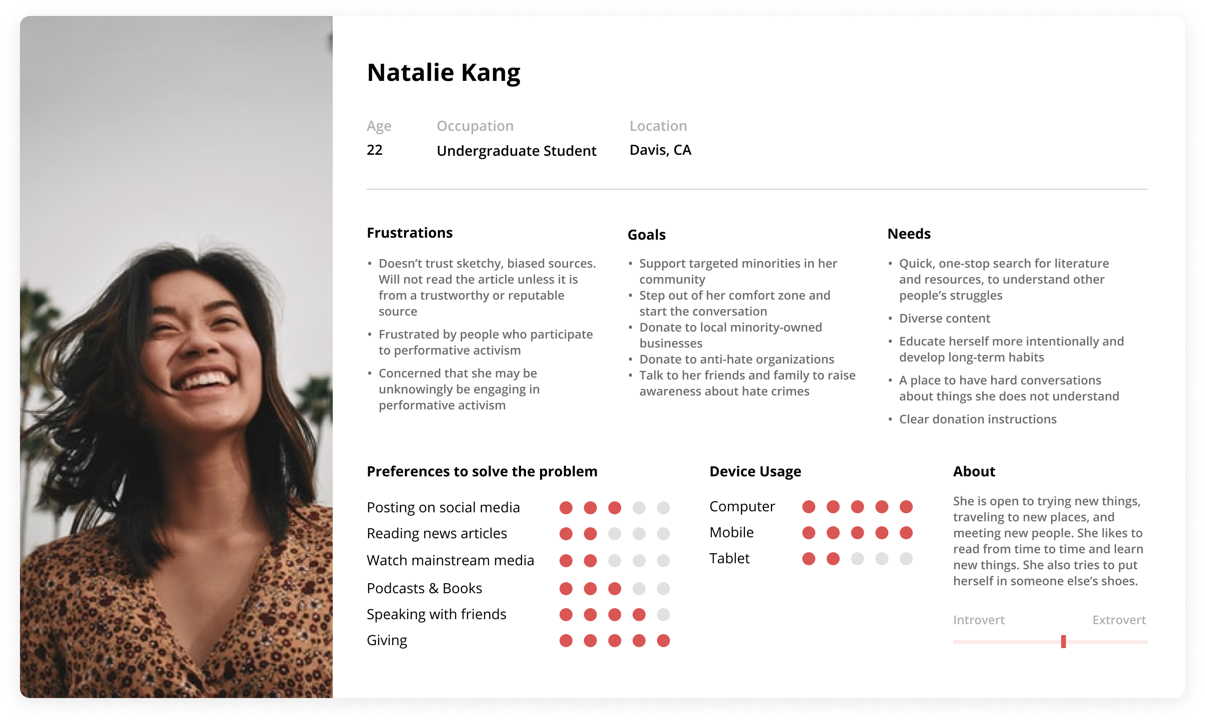
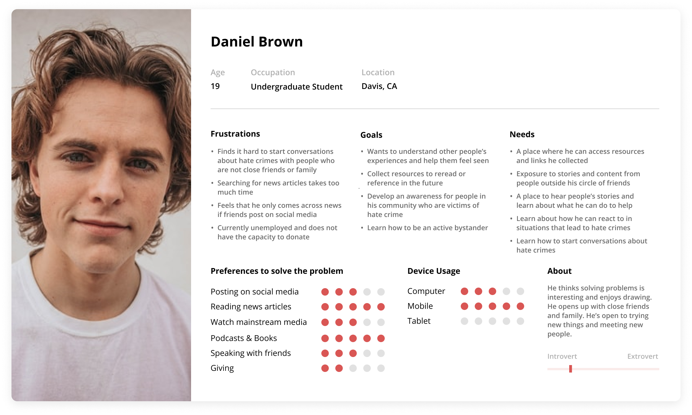
With the accumulation of different insights and common patterns we gathered from user research, we created two user personas focused on the user's preferences on how to solve problems, goals, motivations, frustrations, and needs.
IDEATION
Affinity Mapping
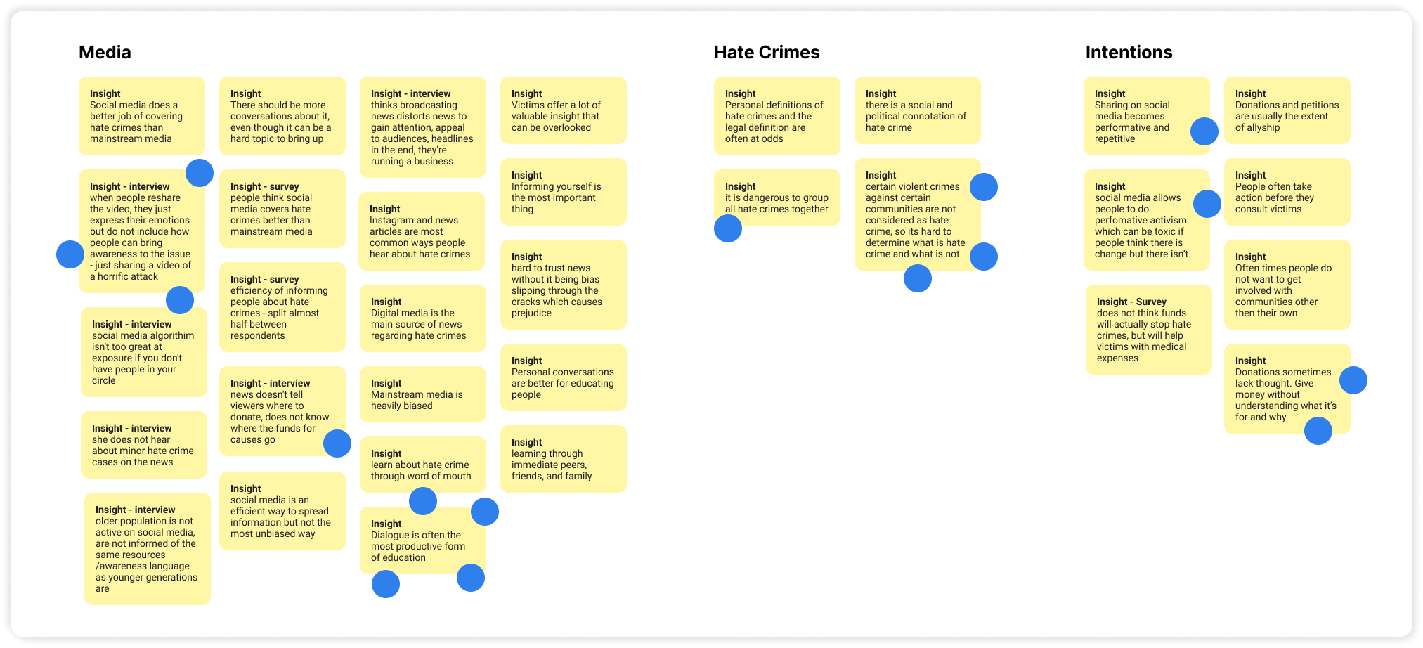
We moved onto synthesize our research findings using affinity mapping. After making connections within our data and identifying common behaviors, we narrowed down three main insights that we used to drive the direction of our app.
01
Dialogue is often the most productive form of education.
02
Donations are sometimes given without understanding the reason behind it.
03
Social media enables performative activism, which is ineffective for real change.
IDEATION
Sketches
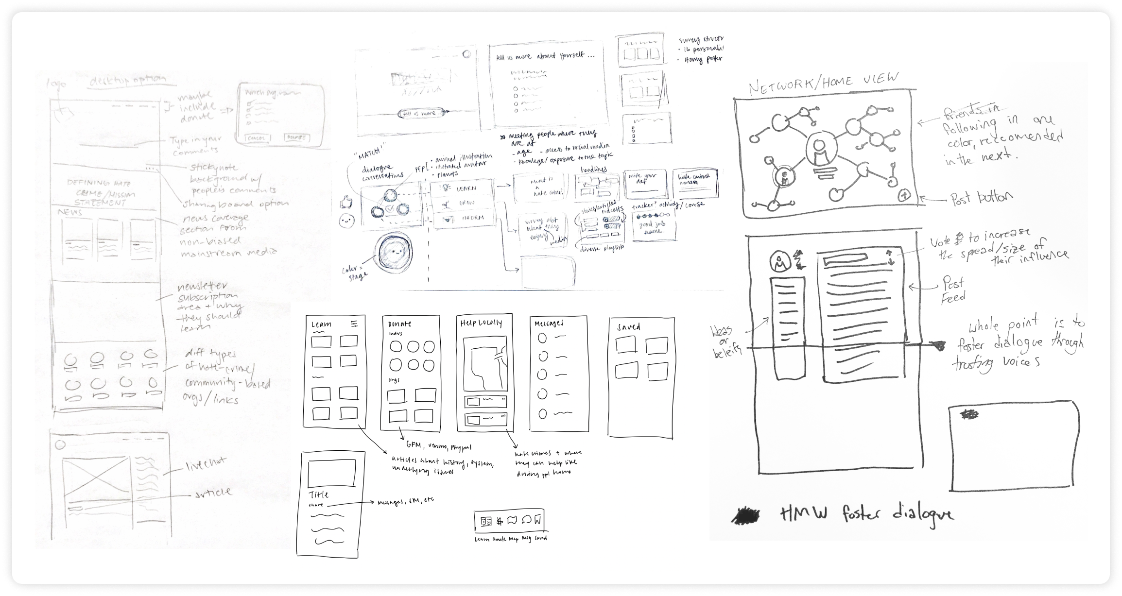
Using our insights from affinity mapping, we sketched ideas for possible solutions. Some key ideas included: creating a community where people can exchange perspectives, a location feature that allows users to help locally, and curating resources to provide users with relevant information.
IDEATION
User Flow
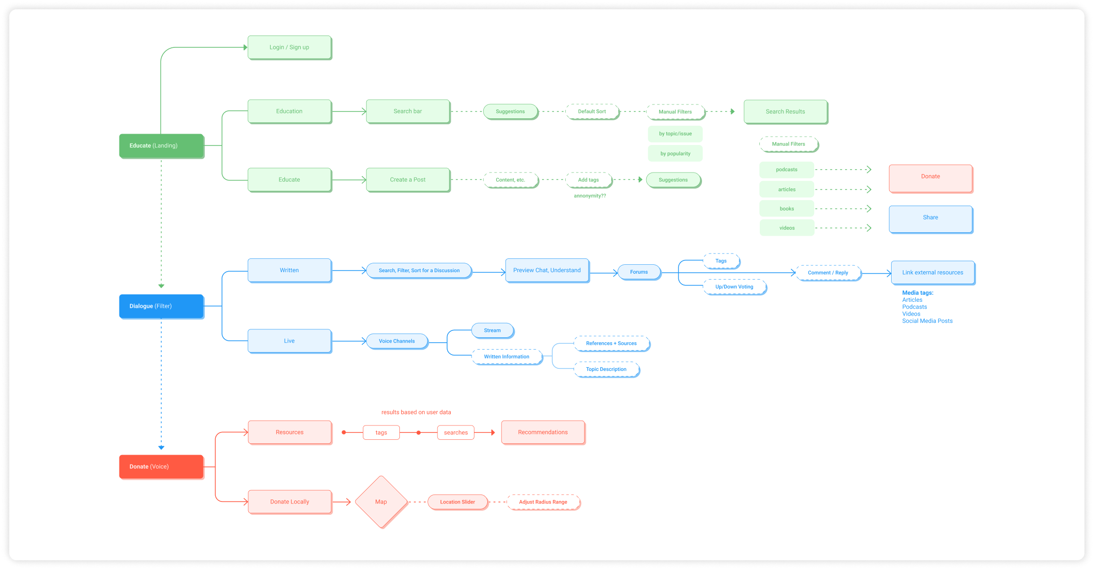
After uniting our sketches, we created a user flow to better understand the new architecture of our app. We decided to organize and structure our content into three main sections that focused on helping people take action against hate crimes: educate, dialogue, and donate.
LO-FI PROTOTYPE
Creating the basic framework
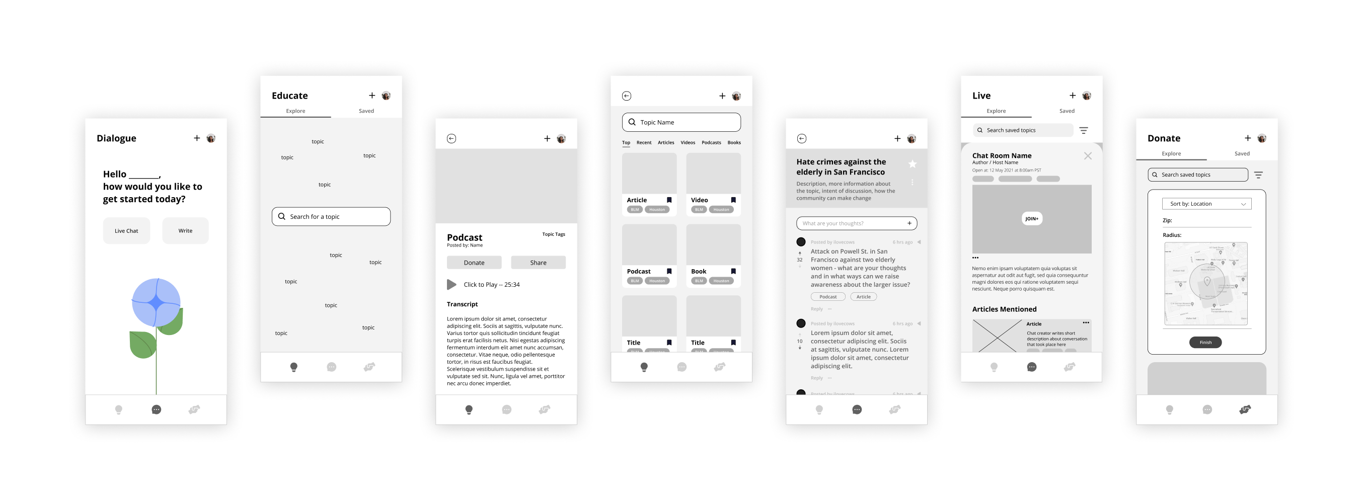
We then created lo-fi wireframes and prototyped them using our user flow. This basic skeletal framework of the app allowed us to focus on functionality over appearance and we implemented 3 sections:
01 Educate
Educate allows users to browse different media to educate themselves about the topics they are interested in.
02 Dialogue
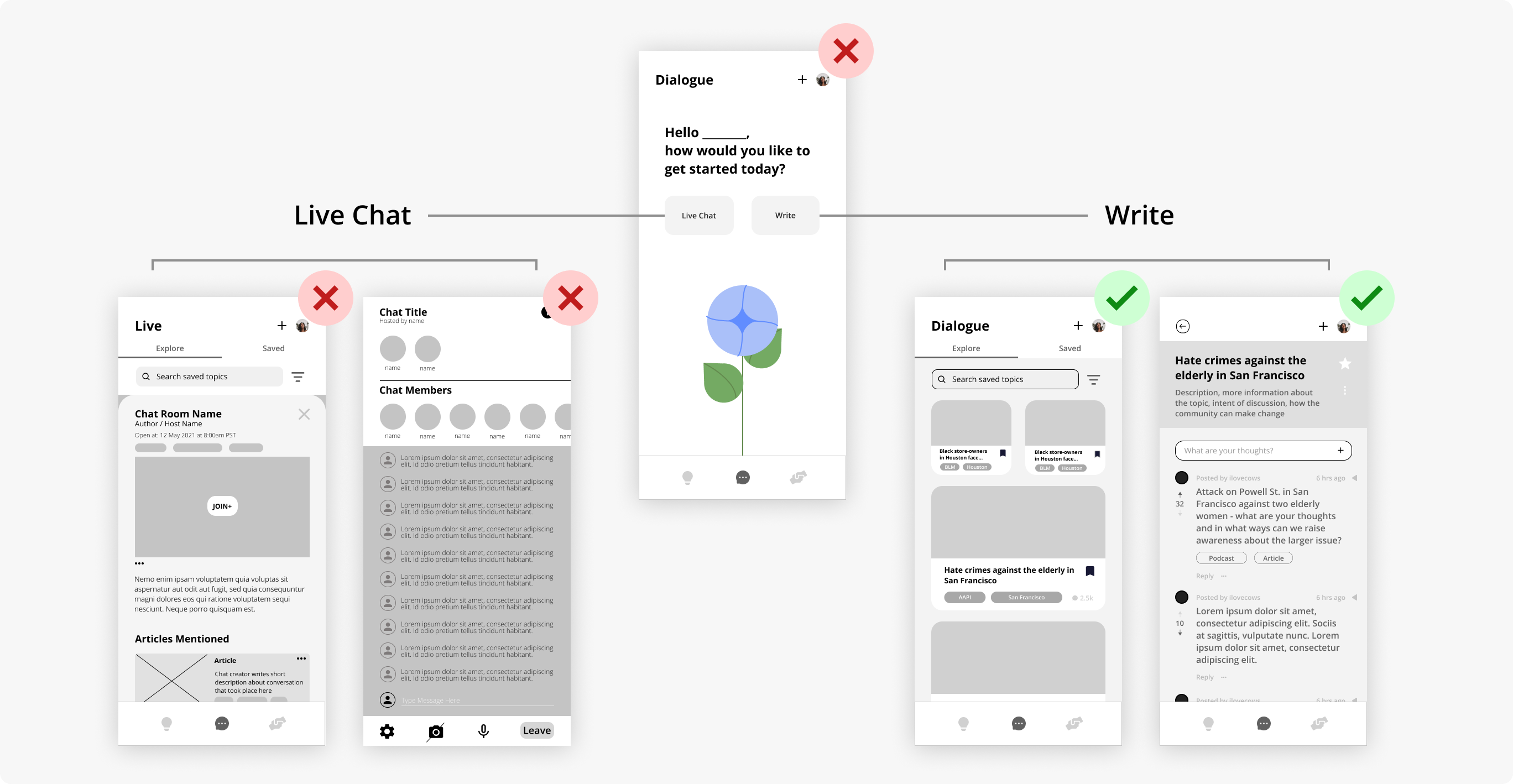
Dialogue includes a Live Chat to help people interact with each other through streaming and a Write page to allow people to type out their thoughts.
03 Donate
Donate allows users to browse for different donations to direct their support.
LO-FI USABILITY TESTING
Testing our features
We created a set of tasks for each section to test the user’s ability to navigate the app and asked about overall first impressions. This first round of testing was crucial in providing good insights for changes within our initial user flow.
Removing Live Chat
We decided to remove the Live Chat component of our Dialogue section because users expressed cognitive overload and confusion between the two options of Live Chat versus Write. Users also felt that they would be more intentional with their words in written discussions as opposed to live conversations online.
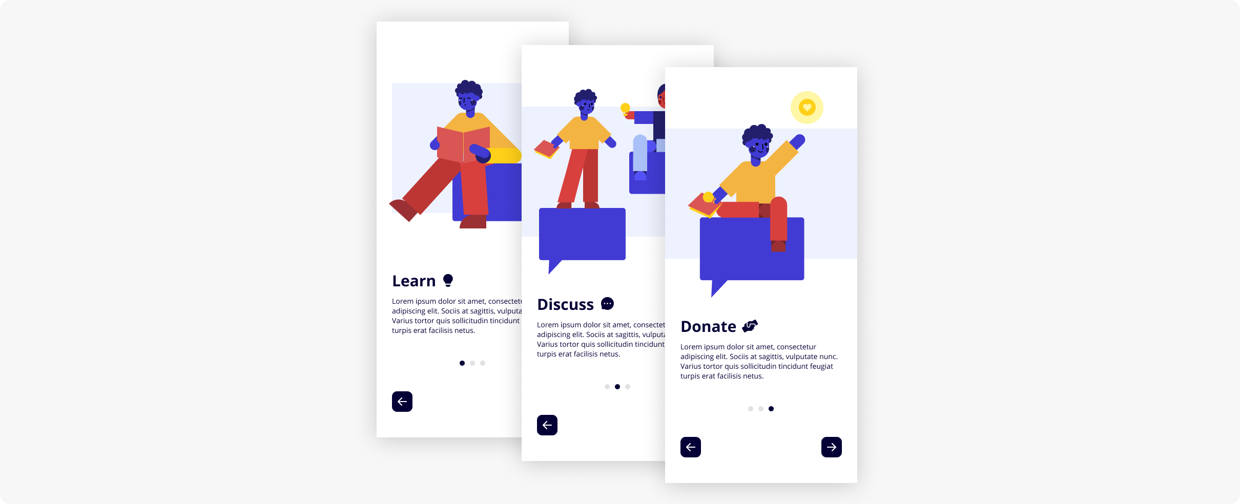
Onboarding
We found that users were unsure about how to navigate the app, so we added an onboarding section to introduce each section and its purpose for a smoother user flow.
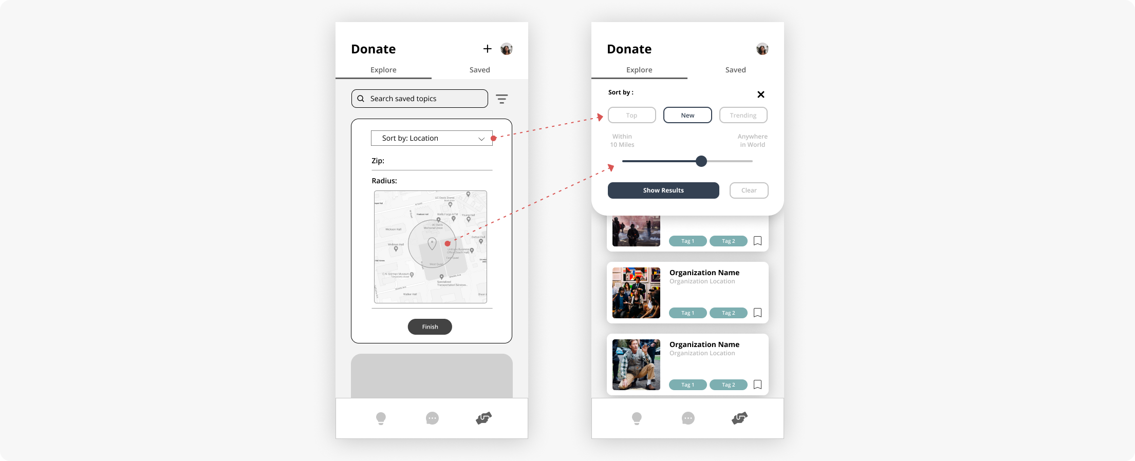
Filtering System
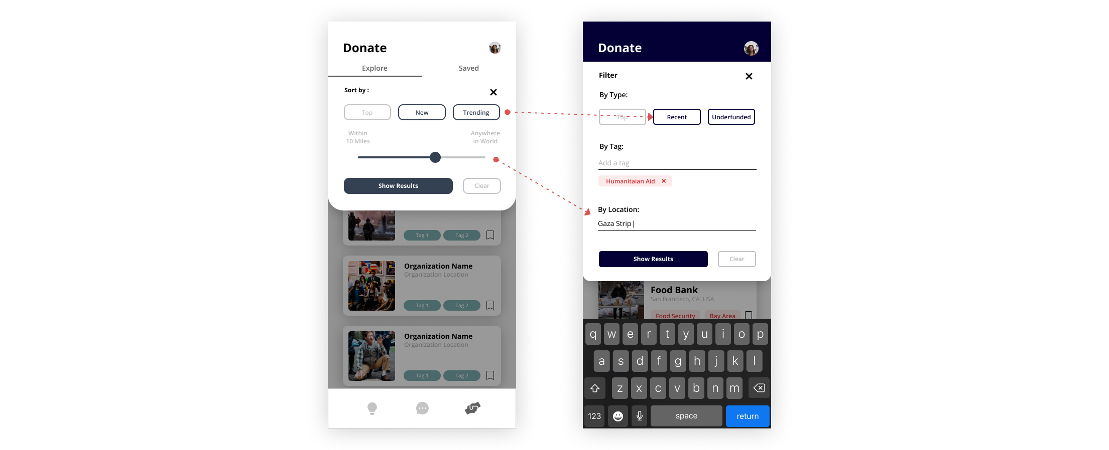
With the filtering system, we wanted to emphasize local donations, so we implemented a location filter in addition to category filters. For our location filter, users expressed the limitations of having a radius filter, so we replaced it with a distance slider. Users also preferred fewer filter categories to choose from, so we replaced the dropdown filters with button filters.
MID-FI PROTOTYPE
Painting on some color
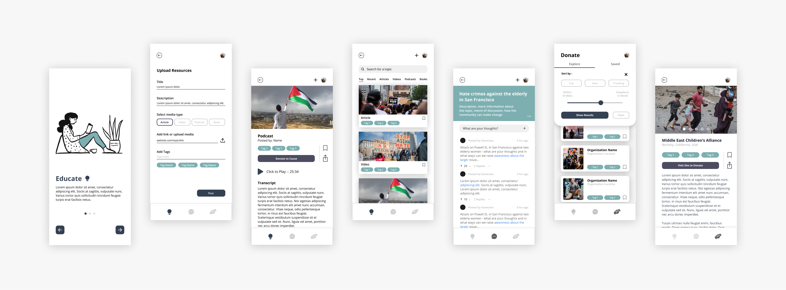
In preparation for our second round of user testing, we focused on unifying our overall visual design in our medium fidelity wireframes.
01 Color Palette
We implemented a neutral color palette that we felt allowed users to approach topics with a more receptive, open mind. We wanted to go for something neutral, comfortable, and calm in response to the news and stories on the app that may be a source of strong emotions, such as frustration and anger.
02 Unified Card Layout
We unified the card layout for each section’s feed to create a clear visual hierarchy to improve mobility when changing between sections.
03 Actionable Wording
We realized better word choice was necessary to encourage users to take action, so we changed appropriate section names. (e.g. Educate → Learn, Dialogue → Discuss)
MIF-FI USABILITY TESTING
Retesting our features
In this second round of testing, we instructed users to perform the same tasks for each section. We focused on understanding our users’ intuitive decision-making and emotional response to the app.
Rethinking the colors
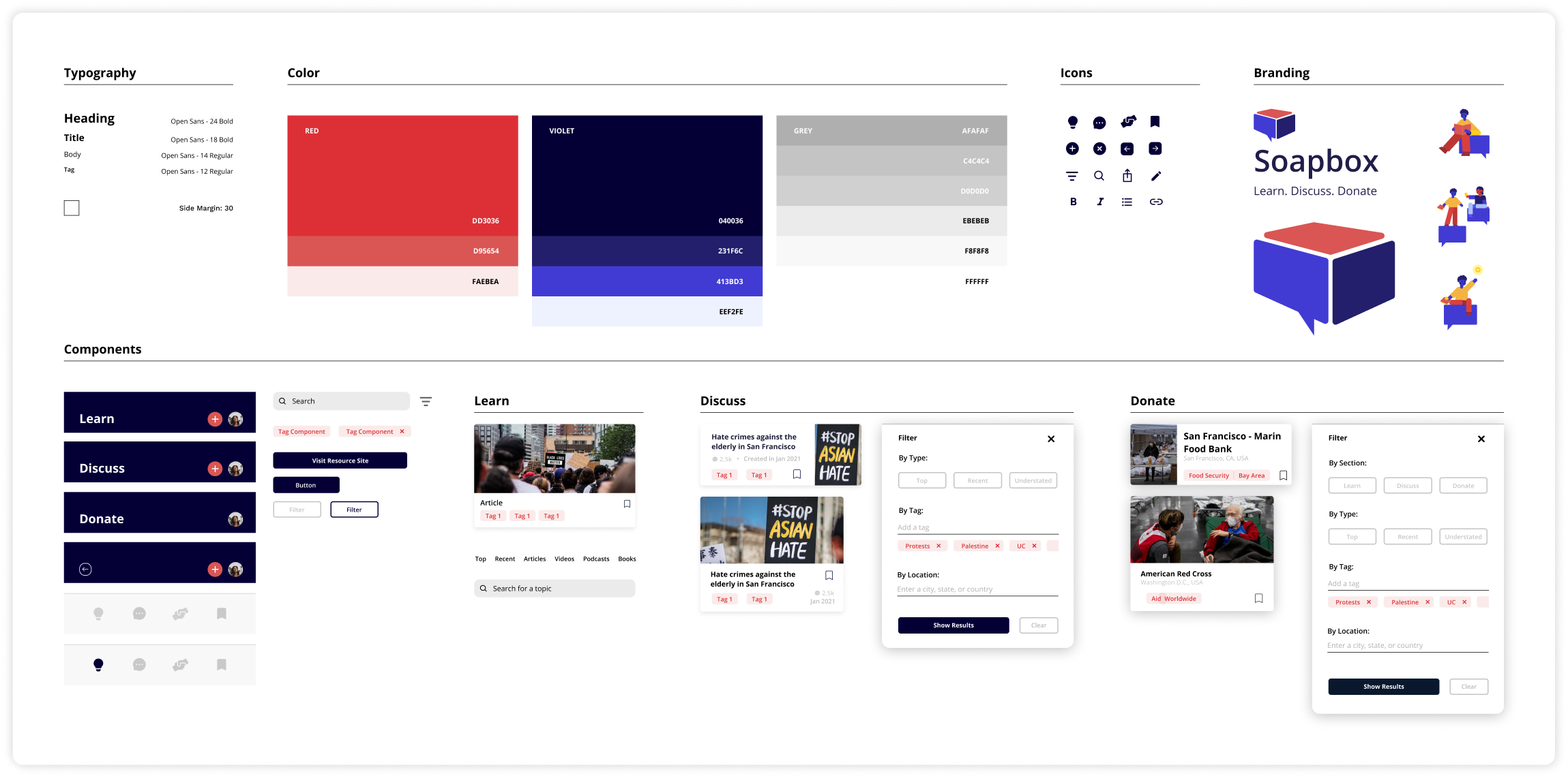
Users felt that the colors were very calm, plain, and did not match the content that our app displayed. With this insight, we realized that our original color palette was too muted and did not reflect the message we wanted our platform to represent. Thus, we revised our design system and chose colors that better reflected action and urgency. We wanted to make users feel more motivated, inspired, and energized to take action.

Another revamp of the filtering system
We found that our filter category word choice (Top, Trending, New, and Understated) and the location slider's vague range confused and limited users. Because we wanted to find a way for users to focus specifically on the needs of their community, we decided on a location filter that allows users to enter in the city they wish to read topics from, whether it be their own area or another city across the world. We also updated the filter categories for more clarity about their meanings.
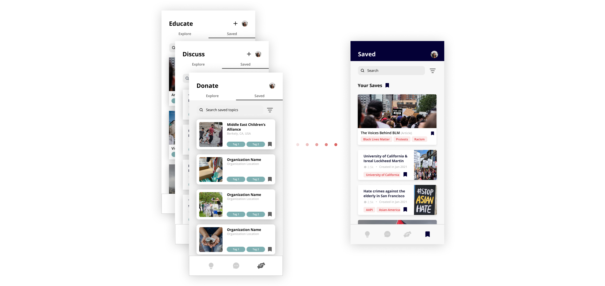
Saved Content
Users expressed confusion about having a different saved page for every section. This led us to consolidate the individual saved pages into one local saved page, which is more intuitive and would allow them to access their saved items from one place.
HI-FI PROTOTYPE
Make a change with Soapbox!
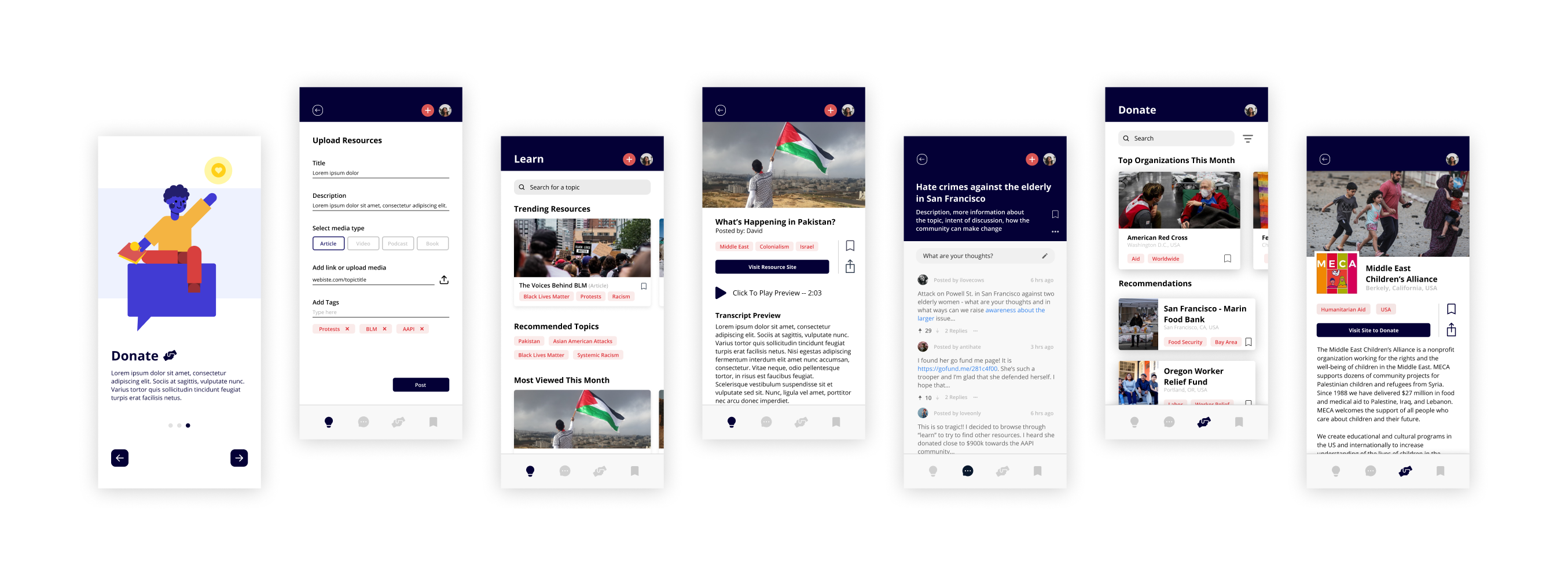
Learn Section —

Customized Feed
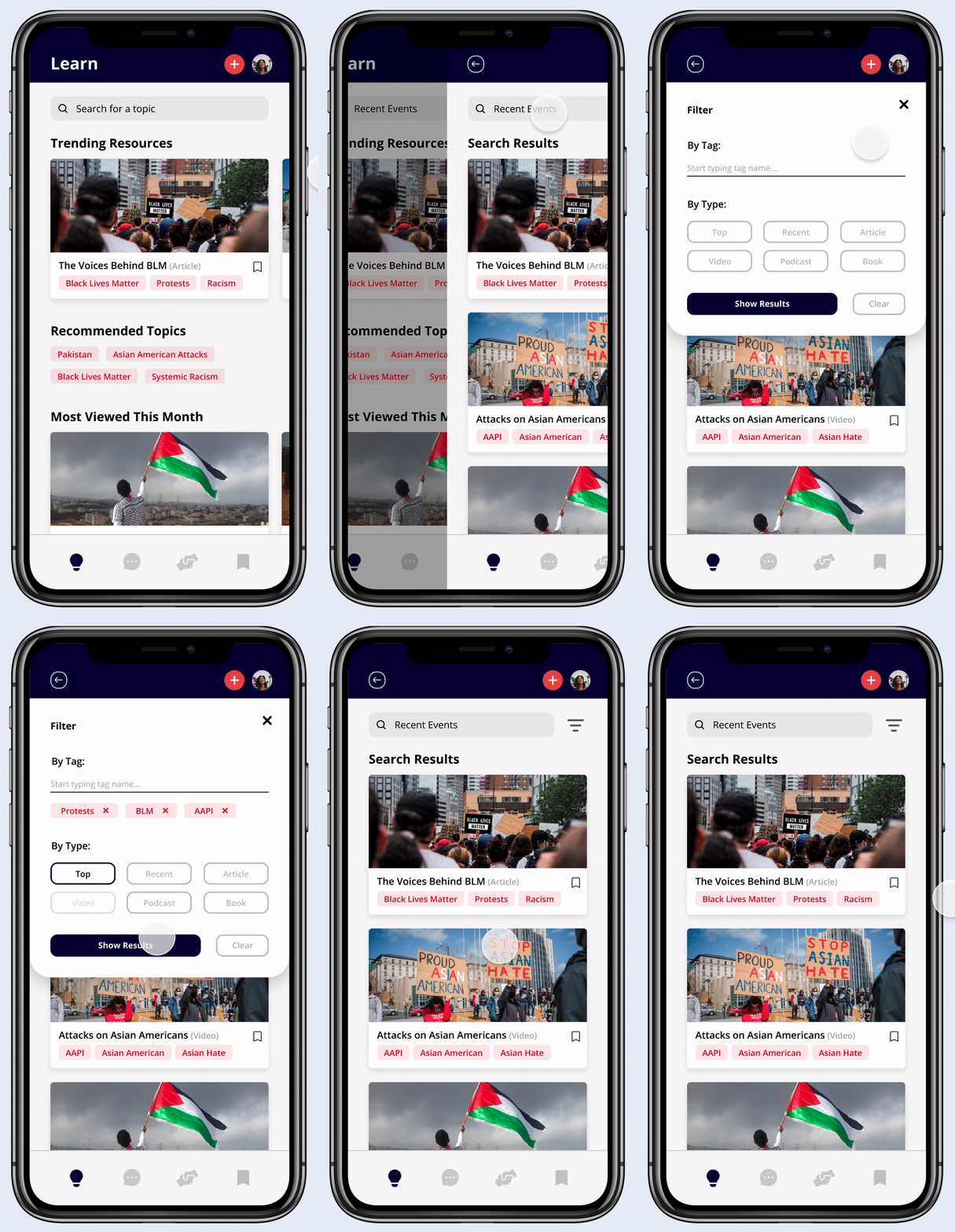
The learn section provides users with a collection of resources about different issues that they can use to educate themselves. The landing page provides a customized feed of highlighted resources, as well as recommended topic tags for the user to explore.
Search & Filter
We included a search bar to allow the user to find resources about any issues they are interested in and after searching, users can filter through what they’d like to see by tag or by media type.
Resource Collection
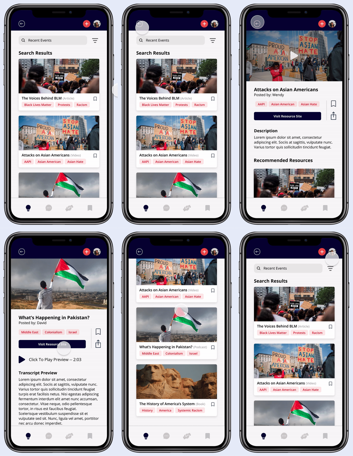
The resource collection includes a variety of media types, as we found through our research that some people prefer articles, while others prefer videos or podcasts. Each resource page also provides recommendations to encourage users to continue their learning.
Upload Resources
Since our app is meant to be a collection of resources put together by the community, users can easily upload and share educational material here.

Discuss Section —

Join a discussion
Before joining, users are briefed about the purpose and context of the discussion. Users can then scroll through threads, post and reply, and even link resources to support their thoughts.
Create a discussion
Users can start their own conversations by creating a discussion. Users are prompted to enter appropriate information before others can join.

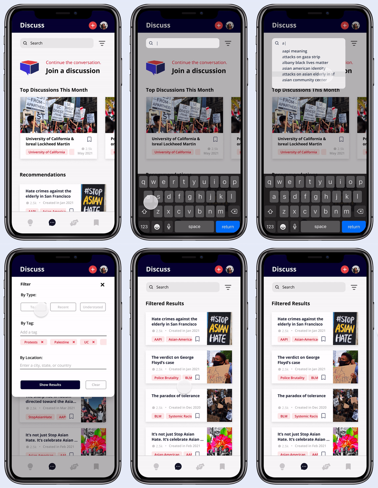
Search, Filter, Browse
Users can search for a specific discussion and browse discussions beyond those recommended for them. They can also filter and sort results by tag or by location, which allows them to engage with their community or different communities beyond their own.
Donate Section —
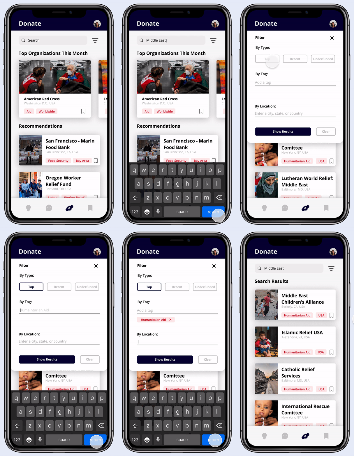
Search Organizations
On the donation page, users can browse different organizations and filter them to their liking.
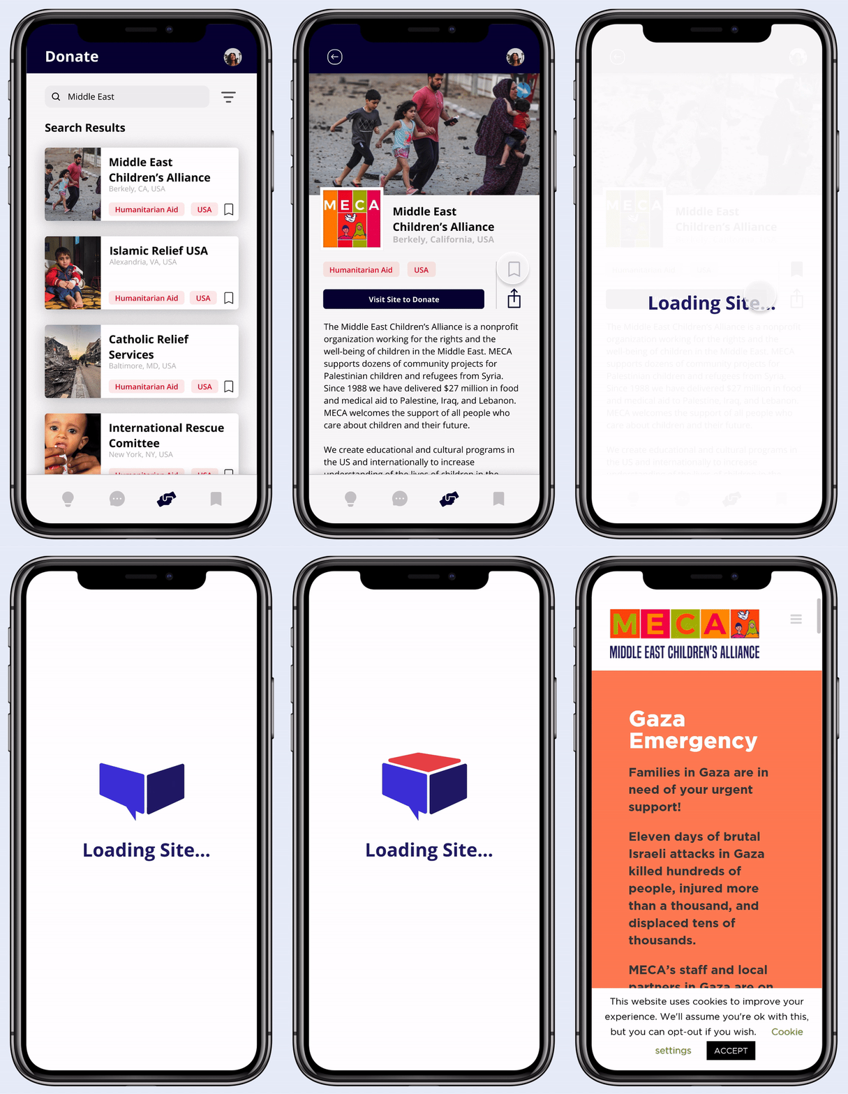
Organization Profiles
Selecting an organization’s card opens up a profile that includes a mission statement, link to donate externally, and similar recommended organizations.
Saved Section —
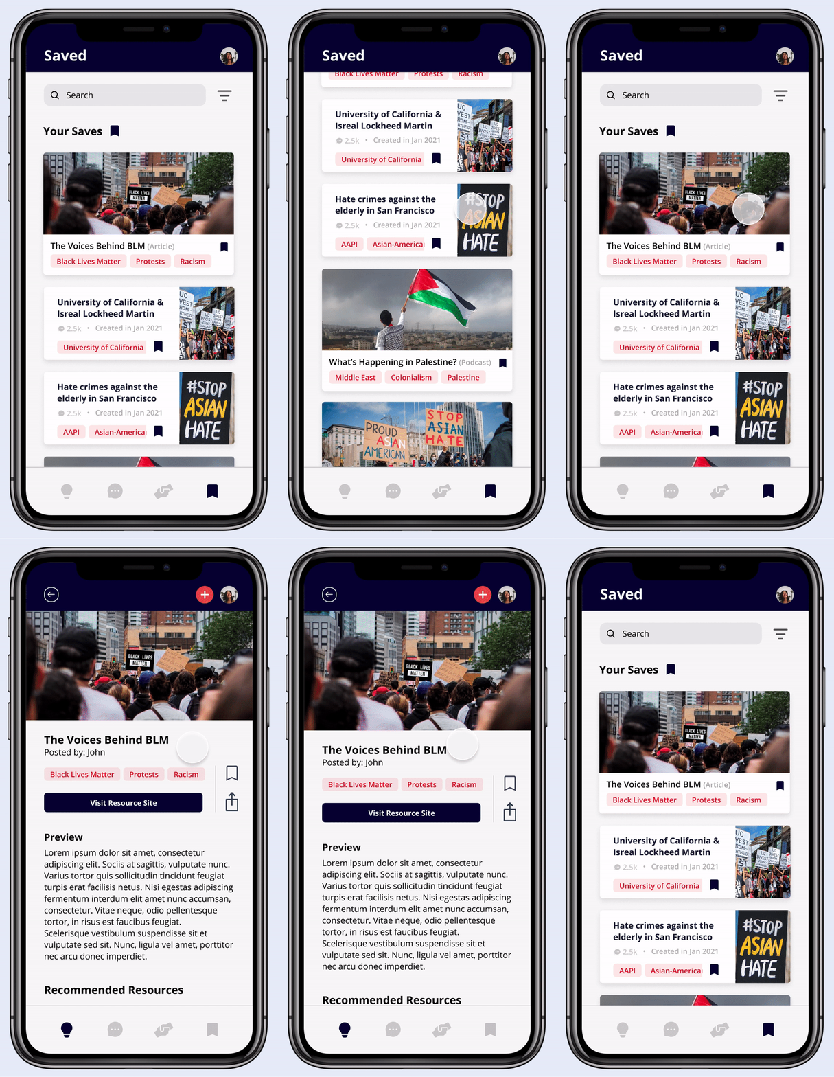
All in one place
The saved page brings together all the bookmarked content into one convenient page that encourages long-term engagement.
DESIGN SYSTEM
Evoking action & urgency
REFLECTION
Final Thoughts
Takeaways
Designing this app was a challenging, but rewarding journey. I learned to let go of ideas that weren't working and adapt when things didn't go as planned. Ultimately, I remembered to focus on the users and their goals.
Challenges
Because of the project redirection after the first round of research, trying to keep up with the 6 week design sprint was tough. Although my team had to hold some extra work meetings, we persevered to meet our deadlines.
Ideation was also an overwhelming process because hate crime is a serious issue and solutions we came up with didn't feel adequate in solving it. I stepped back and reviewed insights from user research to narrow down ways we could make an impact on a smaller scale, while meeting user needs.
Next Steps
Given more time, I would’ve liked to explore a feature that checks the quality of resources that users upload through reporting or alerting. I want to ensure that Soapbox is a safe and reliable platform for users to learn.
One of our goals was helping users develop long-term commitment to educating themselves and fighting hate crime. A potential idea is integrating a daily recommendation system, to encourage users to learn about something new everyday.
Why Soapbox?
You might be wondering, what’s a soapbox? A soapbox is a raised platform on which one stands to make an impromptu speech, often about a political subject. We named our app ‘Soapbox’ because it gives users a platform to share and listen to different stories and perspectives from a diverse range of people in their communities.
