Background
With remote work on the rise due to COVID-19, many people are struggling to stay motivated while working from home. Over the span of 6 weeks, our team tackled this problem by designing a social networking app to promote productivity and balance. Our project was awarded runner up for the Audience Choice Award on Presentation Day, an event judged by industry professionals and hosted by Design Interactive, UC Davis' first UX organization.
Role
UI/UX, User Research, Visual Design
Duration
6 weeks
Team
Ying Liu, Matthew Paquette, Mariella Terrenal
Tools
Figma, Notion, Google Forms
Problem
With the shift to remote workspaces, how might we help students better balance their school, work, and social lives to avoid overworking and maintain productivity?
Even though working remotely allows more flexibility, students often have trouble keeping up due to lack of structure of online classes and struggle with maintaining balance between school and life. Because many students are isolated at home, they are also unable to socialize in collaborative workspaces.
USER RESEARCH
Literature Review
We began our research process by reading articles from John Hopkins University, Psychology Today, and University of Cincinnati. Through these texts, we explored effective time management and the psychology behind habit in maintaining balance in life.
Key Insights
→ Changing environments can disrupt the development of habits.
→ Support systems allow for accountability, motivation, and goal-sharing.
→ Several aspects of time management and organization, such as goal setting, were found to be especially challenging for students.
USER RESEARCH
Understanding our users
To better understand our users, we categorized the different topics we wanted to learn about. Our questions focused on the following:
1. Get to know the user
E.g. Age? Gender? What environment makes you the most productive? Where do you usually work?
2. Work management
E.g. How do you organize/block your time for work? Do you like the way you currently balance different aspects of your life?
3. Current habits
E.g. Can you show me the current productivity apps/methods you use? How do you use them?
4. Product specifics
E.g. What features would you like to see in the productivity apps you are currently using? What are your favorite features in existing apps?
We received a total of 103 responses on our survey and conducted interviews with 8 different college students to learn about their experience since the shift to remote learning.
Survey Insights
68%
use to-do lists or calendars as a productivity method
70%
find themselves most productive in their rooms
88%
currently work in their room or another part of their house
Interview Insights
"I want to spend less time on school because I definitely overwork myself. I want to put more time into things like family, clubs, self care, and checking in with friends."
"Being at school, a cafe, or any place meant for studying puts me in work-mode. Not having that has dropped my personal productivity a lot."
"It's easier to fall behind because there's no structure with online classes and time blends. It's hard keeping myself accountable without others around."
USER RESEARCH
Pain Points
We then summed up our research insights into 3 main pain points: overworking from school, no separation of space and lack of support system.
→ Overworking from school
School work takes up more time than users want and they wish to allocate more time to other important aspects of their life.
→ No separation of space
Combining home and work spaces has caused users to struggle with productivity, due to absence of a suiting environment.
→ Lack of support system
Not having others around amidst the pandemic has left users unaccountable and less motivated.
USER RESEARCH
User Personas
With the findings from our research, we narrowed down our target audience to college students and created user personas to outline their struggles.


IDEATION
Affinity Mapping
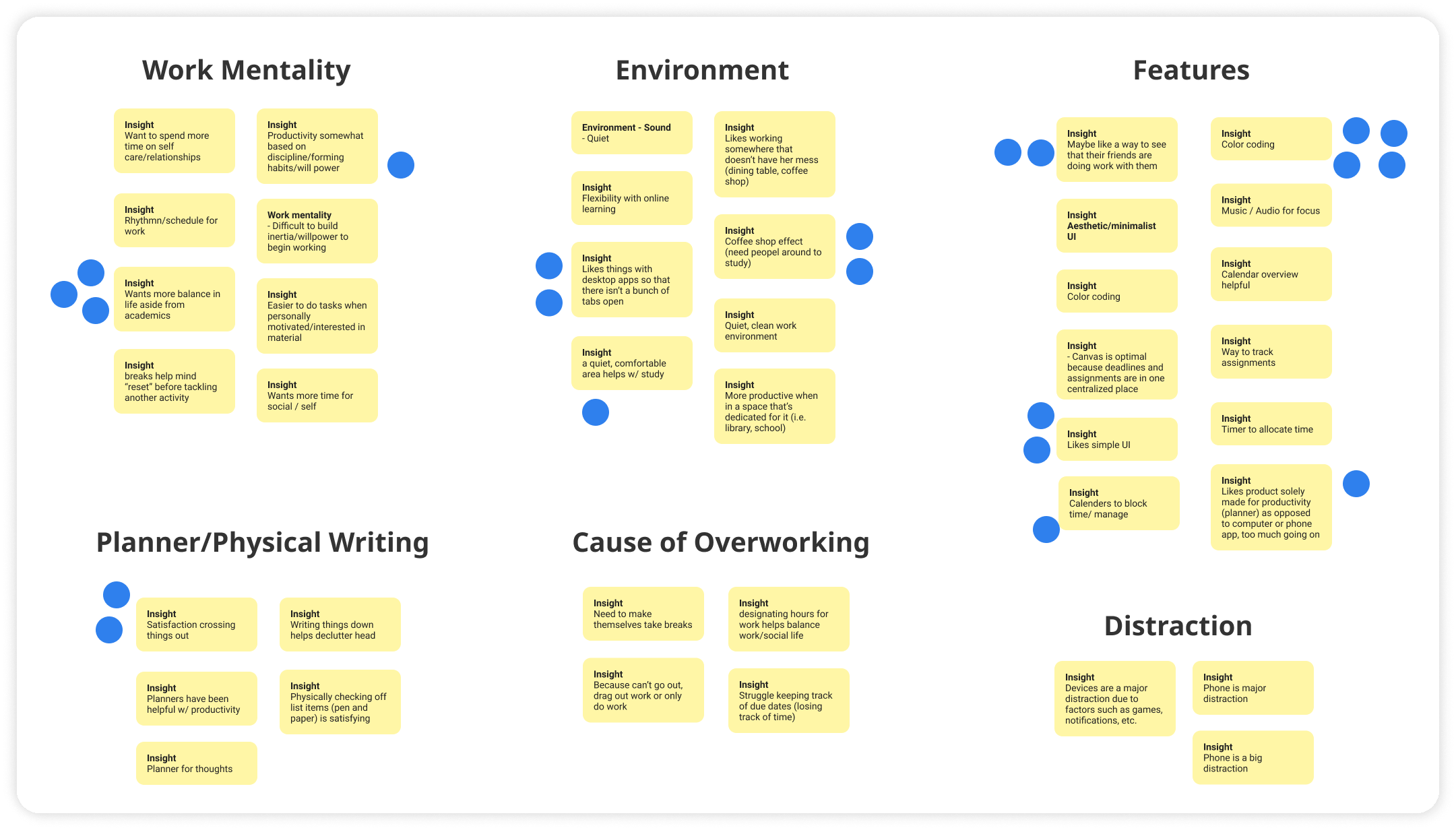
With the insights from user research, we began to brainstorm, discuss, and vote on possible solutions through affinity mapping. We decided to focus on the social aspect of studying that has been lost due to remote learning, since users expressed their productivity dropping without these study spaces. Some ideas we explored include shared to-do lists, habit trackers, journaling, and workspaces where users can call one another.
IDEATION
Sketches
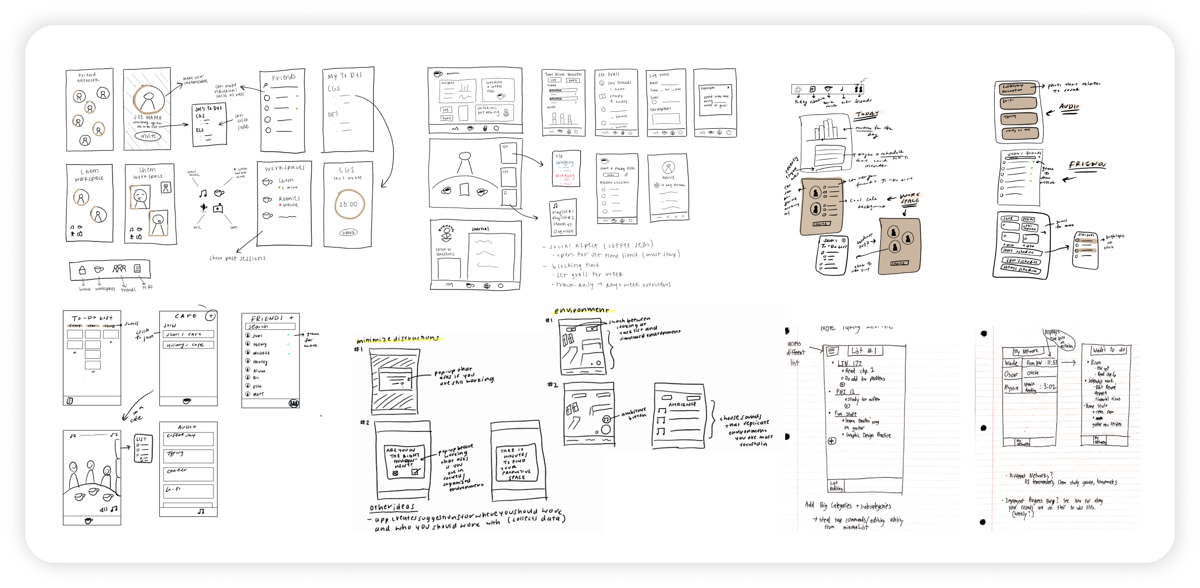
We then produced sketches based on our ideas, finding ways to combine productivity and socializing. We worked through many iterations, as the possible solutions for tackling productivity and overworking were endless.
ITERATIONS
Bringing our ideas to life
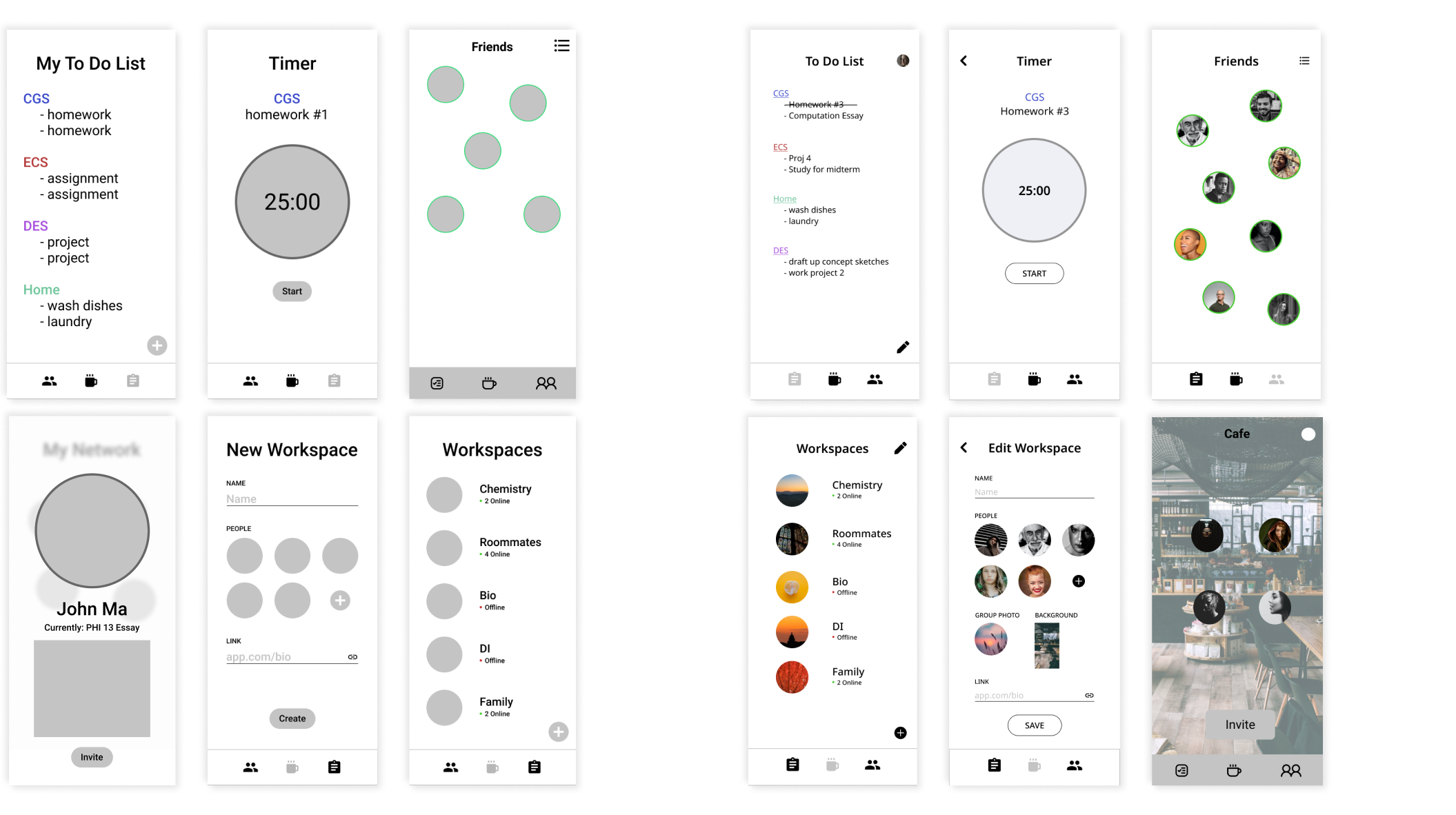
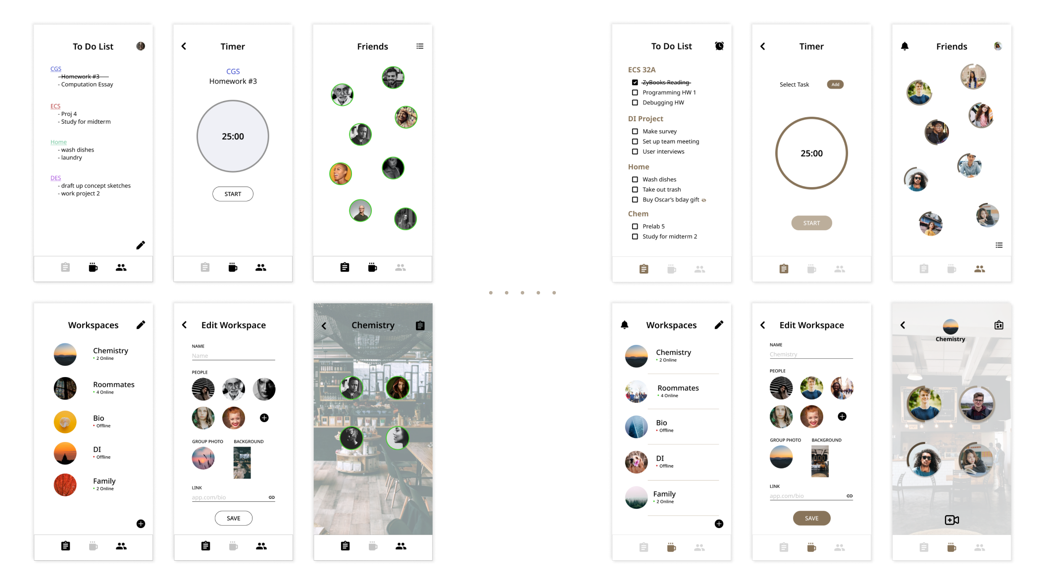
With our sketches, we began wireframing and bringing our ideas to life. We laid out the general format and features including 3 sections: To Do Lists, Workspaces, Friends. We then proceeded to flesh out the design and prototype our frames.
→ To Do Lists
To Do Lists can be created by the user and organized into different categories. They are shared with the user's friends.
→ Workspaces
Workspaces allow users to hold work sessions with different groups of people.
→ Friends
Friends shows users who is actively working, as well as what they are working on and their timer for the task.
Lo-fi Wireframes
Mid-fi Wireframes
ITERATIONS
Usability Testing
With our mid-fi prototype, we conducted usability testing with 8 college students to see if our app was intuitive and captured the overall feel that we were aiming for. We created a list of features we wanted to test and developed a script with questions to ask.
To-Do List
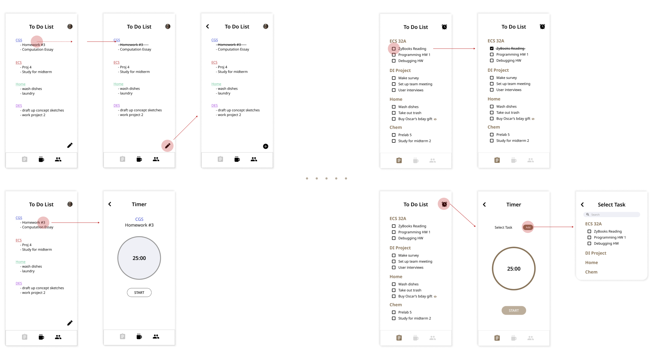
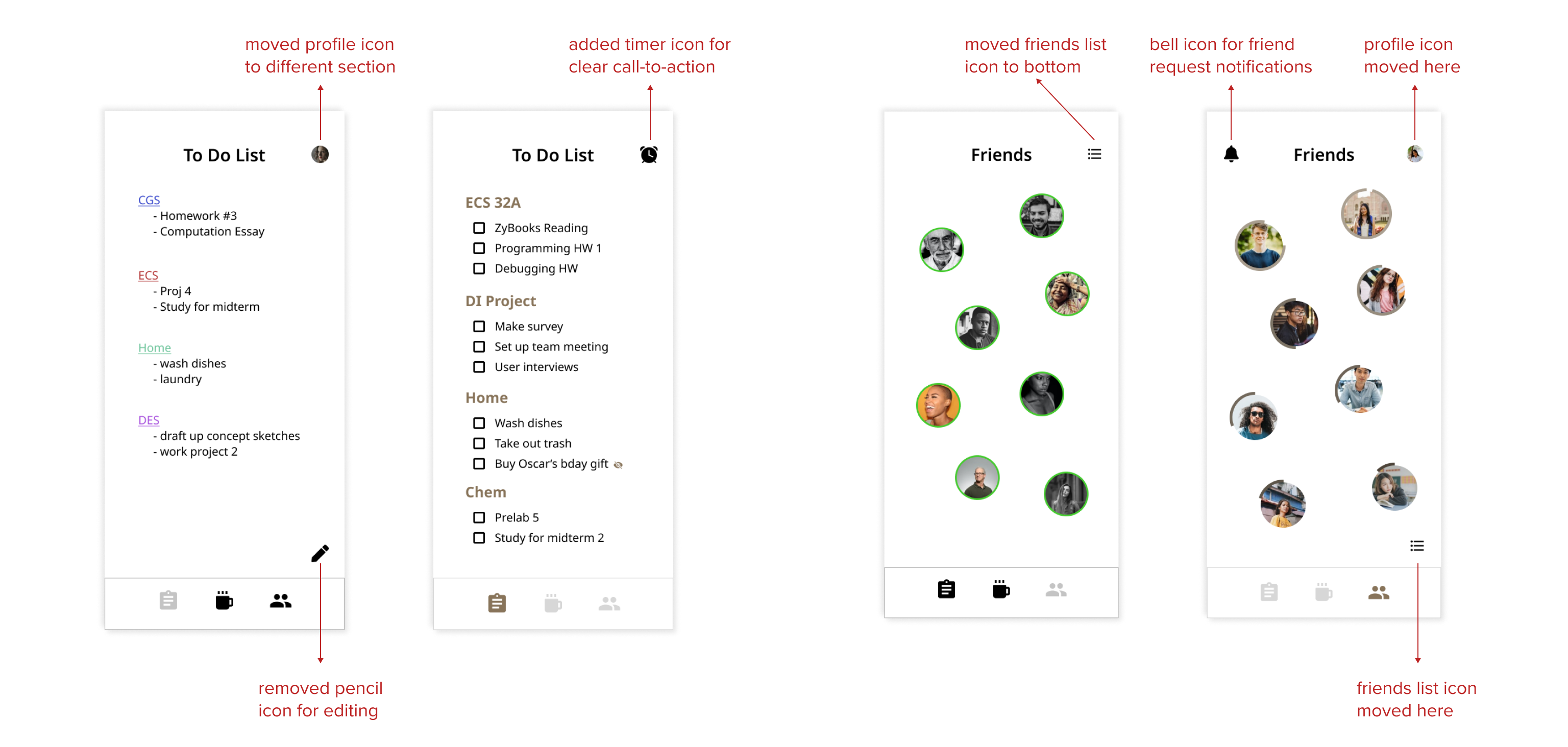
The to-do list feature had confusing interactions that weren’t intuitive and needed refinement.
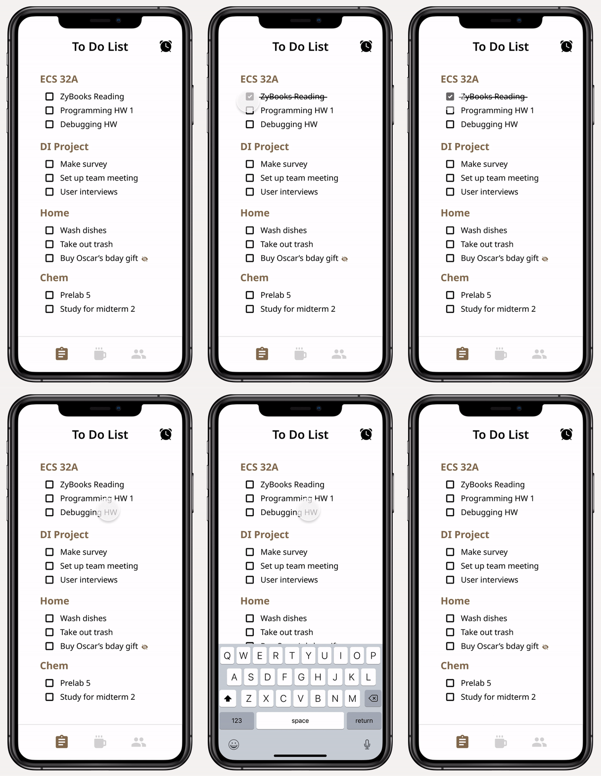
→ Our original idea was to have a "swipe to delete" interaction, but users were more used to a click interaction for checking off tasks. This led us to integrate checkboxes for each list item to easily tap and check off.
→ We also removed the pencil icon and changed it to a "tap to edit" interaction to follow common apps like Apple Notes.
→ In addition, users had trouble finding the timer feature since there was no clear indication that clicking a task would open that up, so we added a timer icon instead.
Icons
Our users found it hard to figure out the meaning of some icons, so we shifted towards more familiar icons and added icons for interactions we missed, in order to make the user flow more straightforward. We established consistent icons for creating and editing, as well as one for invites from others. We also added the timer icon in the to-do list to make a clear call-to-action.
Visual Identity
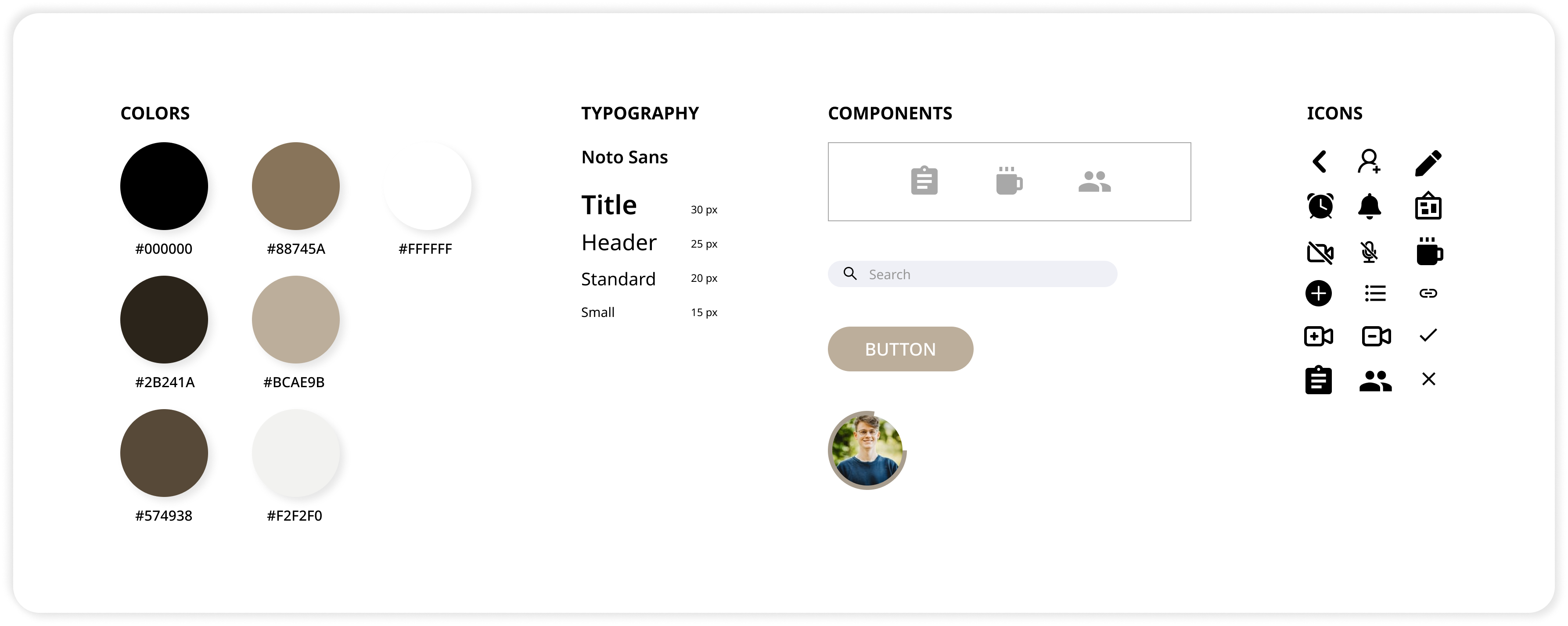
Some users liked the minimal look of the app, but some also felt it was messy with no unifying theme. We decided to make brown our primary color, utilizing different shades to create visual interest. Brown also ties to colors of a coffee shop, which represents our focus on common study spaces.
HI-FI PROTOTYPE
Welcome to CoSpace!
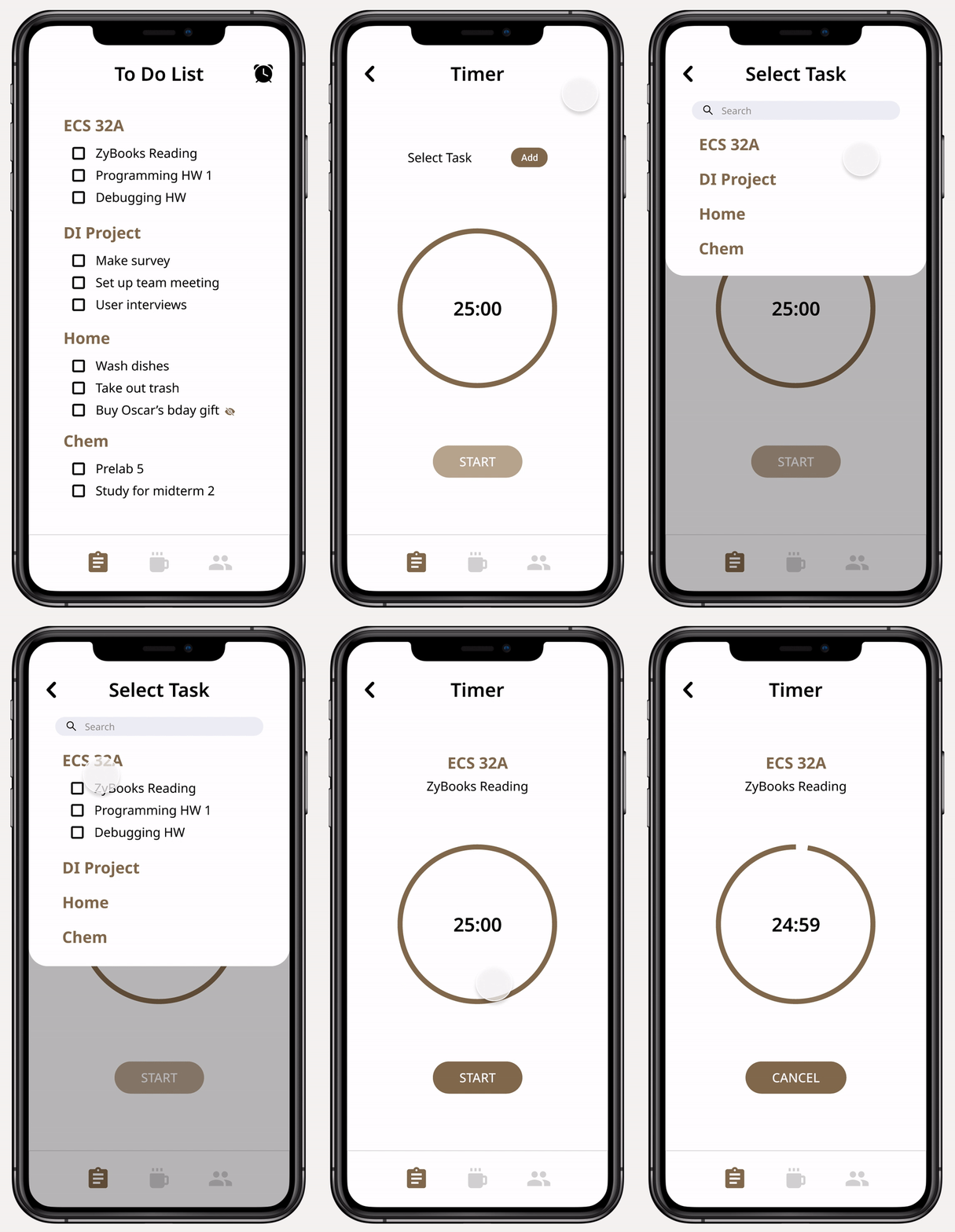
To-Do List
Based on our survey responses, we found that many people use a to-do list to manage their tasks. We took this insight and created a minimal tap to edit to-do list with customizable categories.
To-Do List Privacy
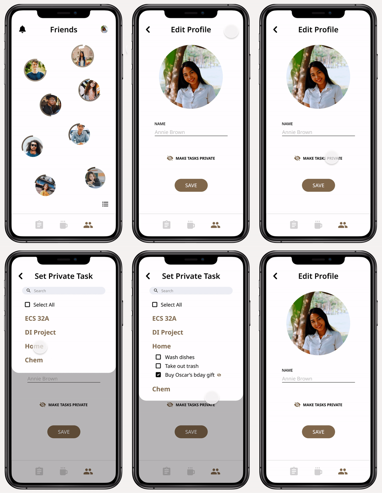
People may sometimes have certain tasks on their to-do list that they don’t want broadcasted to others, so we created an option to make tasks private if users desire.
Timer
We created a timer feature to help users maximize productivity. The timer is set to 25 minutes by default, based on the effectiveness of the Pomodoro technique.

Friend Status
Users can see their network of friends and their activity, like what task they’re working on and how much time they have left on it. This creates an element of accountability, as you are given the tools to keep your friends responsible for completing their tasks and vice versa.
Friend Requests
Users can send and receive friend requests, helping to build a motivational network.

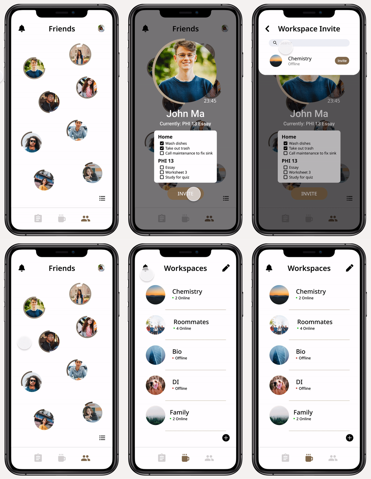
Workspace Invites
Users can also send and receive workspace invites, kickstarting the creation of a productive environment.
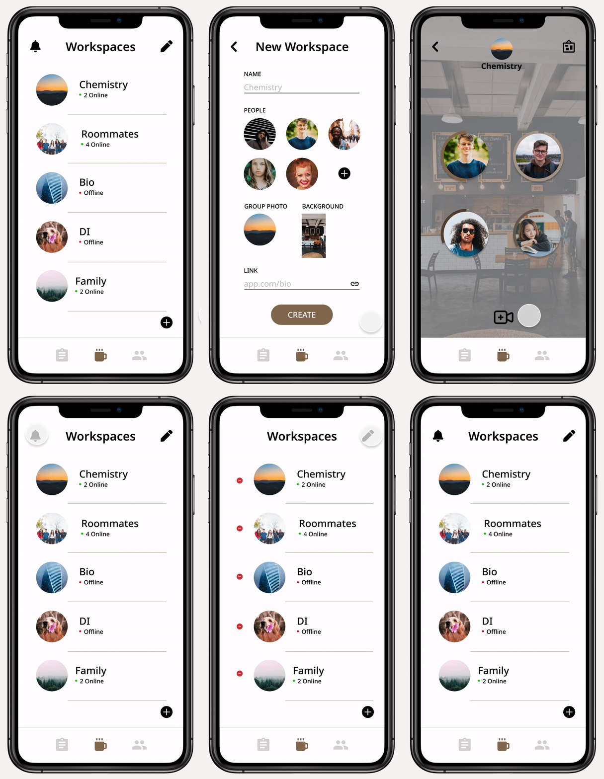
Workspaces
With access to workspaces, users can emulate the coffee shop setting and social interaction of studying with friends that people miss due to remote learning.
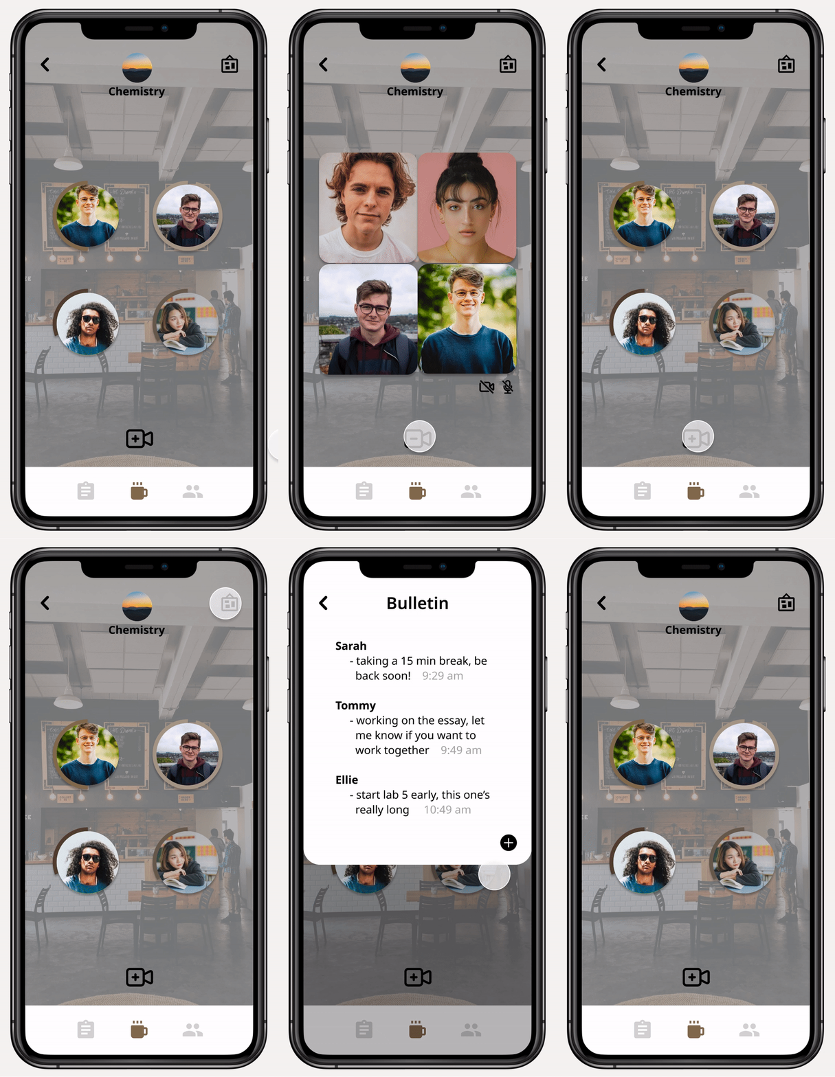
Video Call & Bulletin
From research, we learned that many students work alone in their rooms and miss being able to work with friends in a common space. Within a workspace, we implemented a video call feature to simulate that social experience.
We also included a bulletin that can be used as a collaborative to-do list or to keep your friends updated without disturbing their workflow.
DESIGN SYSTEM
Coffee shop theme
REFLECTION
Closing thoughts
Takeaways
This project was challenging, but a great learning experience. It was my first time working through the entire UX design process, giving me invaluable knowledge about user research, testing, and more. I also gained more experience with designing and prototyping in Figma.
Challenges
Ideation was a vigorous process, as productivity is an extremely broad topic that many have tried to tackle before. Trying to come up with something unique, while keeping our users in mind, took my team back to the drawing board many times. It pushed us to think deep about the reasoning behind our decisions and taught me to not be afraid to start over or change what you have.
Next Steps
Going forward, I would want to explore more dynamic interactions for the to-do list and allow more user customization to make the app fully suitable for users. Further user research would also be helpful in order to find more ways to help people efficiently do remote work.